
As a recovering perfectionist there are many things I still struggle with…
At home, I can’t go to sleep unless our wardrobe doors are all closed off neatly. (I’m convinced hubby leaves them open on purpose to watch me squirm). At work, inbox zero is the norm… and when I’m at a trade show there are key exhibit design mistakes that make me want to stamp my foot and pout.
Time and time again I hear people say that they can’t get good trade show ROI…
So I guess the REAL issue I have is that the following design choices actually contribute to crappy exhibit ROI.
If you’re going to invest in attending these exhibitions it makes sense to give yourself the best odds. I’m sharing these because I don’t want you to fall into the trap of making these key mistakes.
As I walk through an exhibition hall wearing my “visitor” hat (just in case you had any doubts, this is 100% an imaginary wardrobe accessory). Of course I see designs I like, but there’s always some minor things that jump out at me as counter-productive…
Here are some of my top cringe-worthy gripes:
1. Poor lighting
To really show off your brand you want to find the right balance of lighting. This doesn’t mean you have to rig and light from above (definitely ideal if you have a larger stand). But you want to be sure you allow for enough to highlight key areas on your stand.
It’s a real balancing act…
Too little and you’ll risk looking dull and any product/staff/design features will disappear. But, if you go the other way and use great thumpers better suited to a football stadium, your stand space will be so bright that no one will want to spend time squinting there (staff included).
There’s an art to creating light and shade so some areas pop and people just enjoy spending time on your exhibit.
A final pet hate = Rogue lights.
If you’re going to use directional lighting, point it at something good (a logo, a product, a design feature). Don’t face it into the aisle and blind your visitors. You don’t want them turning to look at a competitor just because they didn’t wear their Ray Bans inside.
2. You have prioritised the wrong things
There’s nothing worse than seeing a beautiful exhibit design with ZERO people interacting with it.
The aim of the game is to facilitate conversations and nurture relationships. Is a meeting room, reception counter or lounge seating really going to do that?
These are old fashioned, often expected inclusions in a design brief. Tradeshow real estate is expensive. In my humble opinion, the presence of these items needs to be questioned.
Most people work bloody hard to break down barriers and make themselves more approachable. If you want to be less “salesy” I recommend you dodge the meeting room and the reception counter.
When exhibiting in Australia a meeting room is only required if you specifically need to have private conversations with customers. Most visitors try to avoid a big sales pitch. It’s the more casual, laid back approach that tends to work best as it gives you an opportunity to build rapport first.
From a cost perspective, you pay more for a structure you’re not using and taking up prime real estate.
Another factor to consider with meeting rooms and lounge seating is visitor dwell time. It’s lovely to have people in your space, but you want visitor turnover so you enjoy more contacts. Pouring all your energy into a few key visitors can be a strategy, but generally people exhibit to go meet as many new people as possible.
Counters are very “Us V’s Them”. If you want to form carefree relationships that are laid back and easy-going, don’t conform to a “May I help you?” mentality or your visitor will too.
3. Displaying too much and how this impacts your exhibit design
You can overcrowd your exhibit design with more than just product… You can do it with messages, imagery and staff too.
My dad always says..
“A stand should look empty until there are people on it”.
I used to think this was his way of getting me to stop playing around with designs. I’ve wised up and realised that there needs to be visual space for people to feel welcome.
Instead of bringing all your equipment can you bring a few key pieces that get the message across and spark conversations? Think key features, main benefits and top 3.
The exhibition stands that get the best results are the ones that prioritise their strategy and really think about how they want to use the space.
Signage is one of the most important elements to any exhibit. Here’s my Formula for Exhibit Signage that Works.
4. “So… What do they do?”
Not being clear about what you do is one of the most devastating trade show mistakes I see. If people can’t figure out what you do or why they should stop, you may as well save your money and not exhibit.
It’s heartbreaking because they have often gone to so much effort only for it not to connect with people.
- What do you want people to know about you?
- Can they tell that from looking at your stand?
People are time poor (and let’s be honest, lazy). Unless it makes sense to them they’re going to keep on walking.
Even some of the larger more recognizable brands are guilty of this…
You might have a logo that everyone knows but what are the benefits of the products you’re promoting? At a tradeshow your staff will have to work that much harder filtering through visitors explaining your offering.
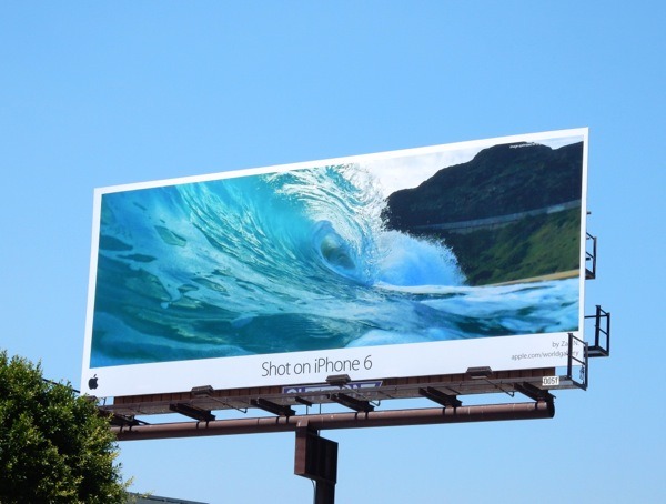
Apple didn’t become a $1 TRILLION company by just putting up a logo…
This Apple billboard was part of their iPhone 6 campaign. Each billboard had different images but all highlighted a key feature of their phone, the camera. It was powerful because it resonated with those in the market for a new phone with a great camera. It’s a great example of how they connect to their target audience.
5. A rigging height war
OK, this can sometimes be hard to avoid because we can’t all be psychics, but sometimes there are shows where EVERY-SINGLE-STAND has a rigged banner.
Often they all want to be the highest so they are seen from across the hall, but the sheer number of them mean you can only see the ones you’re closest too.
What to do if you’re crystal ball is broken?
If you expect a height war you can make a decision not to compete with signage – instead use your rig for lighting your stand properly and spend more money on making your exhibit design work effectively. Here are 10 ideas to get more out of your exhibitions.
6. Shell scheme heights
The more experienced exhibitors, would be well aware of the industry average shell scheme height being 2.4m. This isn’t news…
My pet hate is when the odd supplier uses shell scheme that is 2.5m in height and you get 100mm of the damn structure showing above your custom exhibit that was made 2.4 mtrs. It’s ugly and ends up being the only thing I can see.
You may not be able to control what others build behind you, but it’s worthwhile always check ahead of time the height of the walling used. It’s just an avoidable thing that rubs me the wrong way.
If you want more practical shell scheme tips, here’s a previous post I’ve written: How (Not) to Stuff Up a Shell Scheme
This is obviously a subjective post on my own personal pet gripes. You may LOVE some of the things I despise. That’s what makes us different I suppose…
Have you looked at your design and felt that something was off, but not sure what? I’m happy share my perspective on simple design tweaks that may help with the functionality and ultimately the ROI of your exhibit. Send it to me at jess@theexhibitcompany.com.au for review.
Do you have any design dislikes that I might have missed? Would love to hear from you!
Yours in Exhibiting,
Jessica Turnbull
Tradeshow Strategist
0417 468 487


