There are stacks of sales people eyeing you out from their polished booths.
You’re trying your best to be efficient.
You haven’t got much time.
… You scan each booth for signs of life as you walk by,
Evaluating whether it’s worth your while.
But some of the exhibits are really ANNOYING you!
Their branding is strong, but…
“What the heck to they do?”
The majority of people who can’t figure out what you do will KEEP WALKING!
… They aren’t going to walk up to you and ask…
… They won’t Google you…
… They won’t even think twice about it because they don’t even feel they are missing out!
The company in question might as well have saved their money.
If you aren’t sure what a company does or what their key benefit is as you walk past the exhibit.
The business has failed dismally.
But you, my reader, are smart…
… You KNOW why they AREN’T GETTING ATTENTION, don’t you?
You have 5-7 seconds to catch their eye
There are a number of reasons why you might not be grabbing the attention of your ideal audience, but signage plays a big part.
A picture may be worth a thousand words, but that means nothing unless those words give your audience a reason to stop.
A successful exhibit isn’t just about graphics, it’s about designing to drive behaviour with a MESSAGE HIERARCHY.
This directs eyes to areas of interest and allows visitors to prioritise information.
Is your exhibit is over-cluttered?
Well… Your message is being diluted!
You will end up with an ineffective space that says nothing to visitors.
If you are one of these people with multiple messages it may be time to re-think your communication strategy. (What’s sad is that it’s in this habitat you’ll commonly find bored, restless souls wondering why no-one is interested in their product offering).
Signage or sales funnel?
The trick with signage is to think of it like a sales funnel.
The aim is to create some kind of logical flow.
Are visitors able to self-qualify just by looking at your stand?
Can they direct their own way around your stand?
To get people to stop, your signage has to MEAN SOMETHING to the people you are trying to attract. AKA, your target market.
There’s no point in telling unqualified audiences things they don’t care about.
It’s a waste of your time (and theirs).
Today I’m going to share some signage tips for attracting the right audience.
Primary Level
- Visible from 9-30m away
- Consider this the introduction to your brand
- Think logo, company name, tagline
Secondary Level
- Visible from 3-9m
- Enables people to determine what they want to explore
- Large graphics or dynamic video content associated with the company
- Be courageous and think about what will make people stop
But… Consider your objective at the show – If you aren’t well known, my recommendation is for your branding to take a backseat and highlight your key benefit.
Tertiary Level
- Allow qualified visitors to navigate their way towards items of interest
- Sales people are can get to the nitty-gritty detail
- Chances are they have someone standing in front of them who actually cares
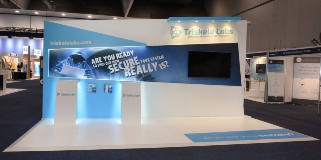
EXAMPLE PROJECT – TRISKELE LABS
A smaller, lesser known company with a great story to share.
The logo is visible but it’s the message that is the hero feature of the exhibit. (Primary)
The bold message was specifically crafted to challenge the audience and single out those who might like to talk further.
To aid this, we incorporated geometric shapes into the design to hold audience attention and draw their eye to the reason they might want to stop.
Digital Signage and Floor Vinyl asking “How secure are you really?” (Secondary)
Two stations were set up for staff to demonstrate how they could hack into a visitors website in under 60 seconds. (Tertiary)
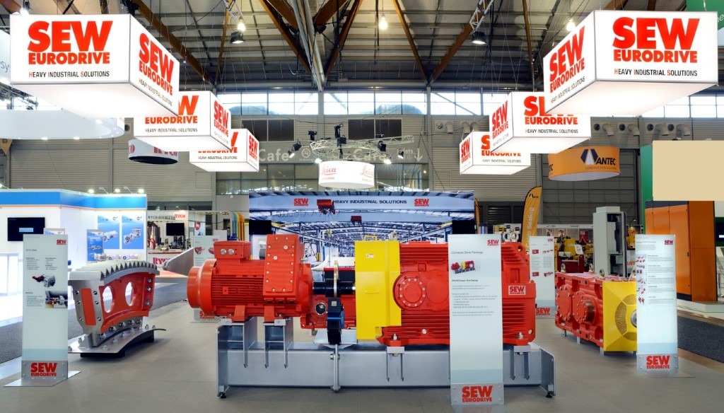
EXAMPLE PROJECT – SEW EURODRIVE
This 12 x 9m exhibition stand doesn’t have your usual rigging setup.
With limited room on the stand space left for signage given the size of the equipment on display.
Our tactic was to rig multiple cubes that hung lower than traditional exhibit signage. (Primary)
This idea was for our client was seen from across the hall, below the masses.
We also wanted to lower sight lines to cast ambient light over the stand so there was a soft glow over their space. (This helped to make people feel comfortable whilst engaging with staff).
Once on the stand, product specification boards shared key features of the equipment. (Tertiary)
An impressive graphic of their warehouse was a talking point on the back wall. (Secondary)
Want Help Getting Noticed?
Let’s talk about your next exhibition.
I’d love to build your next beautiful custom exhibit and help you attract more of the RIGHT people.
Yours in Exhibiting,
Jess 🙂
P 02 8093 3806 | M 0417 468 487
E jess@theexhibitcompany.com.au


